Principles
The increasing trend of mobile learning
Recent years have seen an ever increasing trend toward mobile learning. By recent estimation, over half of all college students have Internet-capable handheld devices. A dean in higher education even remarked that "students were more likely to remember their phone than their wallet".
This being the case, a mobile presence is no longer just a desire, but rather an expectation.
Native apps versus web apps
Generally, two approaches exist for a mobile application:
- Native - Platform-specific applications that run on specific device hardware, generally with low portability, centralized distribution and robust hardware interfaces.
- Web - Web applications that run in an Internet browser, consequently with superior portability but also an apparent lack of hardware interfaces. Although the web is ideally portable across devices as is, in reality browsers interface still vary enough to require variation.
The mobile device platform market is rapidly and continually expanding. As students are early and frequent adopters of new technologies such as mobile devices, developing a native application that serves a substantial number of devices on campus quickly becomes a challenge. Therefore, the Mobile Web Framework instead focuses on providing a web-based platform that can serve the vast majority of mobile devices.
An approach to the mobile web
As opposed to the traditional web, which is a collection of disparate content linked by page hops and searches, the mobile web focuses on an integrated experience categorized by task-oriented and directed content. It offers a single platform from which content can be delivered to all web-capable devices, but it drives many developers away because of the wide range of capabilities between different browsers. The Mobile Web Framework removes this challenge in developing for the mobile web.
By including the CSS and Javascript files provided by the framework, any content provider can write one set of code that works on all devices to the best of their capabilities. Further, by using browser-side technologies (CSS and Javascript), the framework can be included by web applications written in any programming language and running in any server environment.
Beyond these benefits, the nature of the framework as hosted centrally, but leveraged in a distributed fashion, it allows a service provider to establish a unified identity for the entire mobile application, regardless of what server or environment the actual application resides in. This allows content providers to leverage it from their own server with their own business logic and data, while appearing as part of a single environment, heterogeneous in composition but homogeneous in appearance to the end user.
The UCLA Mobile Web Framework is currently in production across numerous institutions, including five in the University of California system with several more preparing to roll out applications using it.
Principles
The Mobile Web Framework has several guiding principles:
- Device Agnostic Works on any web-capable device.
- Graceful Degradation Provides functionality to the best ability of each device.
- Federated Architecture Run centrally, but used in a distributed manner.
- Unified Mobile Presence One outwards presence even in a distributed environment.
- Language & Environment Independent Compatible with any language system and environment.
- Modern Web Standards Complies with modern web standards.
Anatomy
A library of stylesheets, Javascript and other scripts make up the core of the framework.
By providing markup standards, CSS definitions, Javascript functions and other scripts, the framework allows a developer to write a single set of markup that works on all devices that qualify under the framework's minimum standard while still taking advantage of device specific features when available.
The framework, at this time, distinguishes between three different types of phones:
- Full Styles elements with CSS 3 and exposes HTML 5 functionality where available.
- Standard CSS 2.1, HTML 4.01 and ECMA-262-3 (Javascript 1.5) support.
- Basic Least common denominator with XHTML MP 1.0 and WCSS.
Based on telemetry determined from the visiting device, the framework guides page presentation and interactive functionality. Advanced UI and phone-specific features can be made available, all through HTML class and id tags, and, in some cases, through basic Javascript. Therefore, in addition to styling, the framework allows an application developer a standardized way to interface with phone-specific features such as HTML 5 technologies, gestures, geo-location, and more, all through browser-side CSS and Javascript includes.
In addition, for modules running on the same host as the framework, the framework also includes a set of PHP object libraries both to access framework telemetry and to build pages using decorators.
Implementation
The rapidly changing mobile device landscape presents one of the greatest challenges for the mobile developer. In the past, developers have had to address these differences individually. This has added enormous overhead to the development of mobile applications in terms of scope, resources, and budget- both upfront in development and implementation, and later, in maintenance and upgrade cycles. The UCLA Mobile web Framework allows developers (including Universities) to avoid detailed device-by-device planning, implementation, upgrades and maintenance and all their associated costs, and instead makes real the promise of "develop once, use everywhere" by providing a simple abstraction layer whereby the framework itself makes device-by-device determinations.
A central server hosts the front splash page, as well as the framework core (CSS, Javascript, utilities, other assets, and the scripts that serve them).
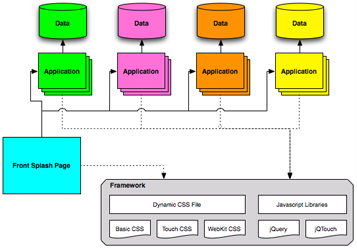
The splash page acts as a portal for various mobile sites. These sites may be hosted on the same central server, or they may be hosted completely separately (such as by a different department). By leveraging the centrally-hosted framework, all these sites are tied together with a common look and feel, leading to the appearance of all these sites as a single application. To achieve this, each application must reference the central framework CSS, Javascript and other utility assets, maintaining a consistent UCLA mobile identity and providing the applications with an enhanced level of functionality.
To implement the framework, a content provider primarily needs only to implement HTML entity classes and include the CSS and Javascript handlers; through CSS and Javascript, these classes deliver functionality defined through the framework for each device classification. Some classes define mobile-styled menus, buttons, and content areas, while others enable interactive capabilities like Javascript element toggling, touch screen gesture detection, and even geolocation and address book functionality.
The framework documentation also provides comprehensive information for developing MWF applications, including specifications for both styling and interface classes in the framework, as well as general HTML recommendations necessary for semantic degradation on non-CSS devices.