Messages
Description
The .message element, in conjunction with a type such as
.alert, .confirm, .error or .info,
provides a message box formatted for a particular context. This message
element works as a top-level item, formatted properly for presentation at
the same level as .content and .menu, as well as
inline within the .content entity.
A variation of this entity also provides a modal popup window that darkens the page behind it.
Example Code
Basic Markup
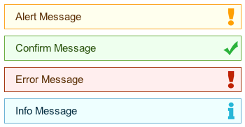
The following demonstrates the four base contexts associated with the message entity:
<div class="message alert">{MESSAGE_TEXT}</a>
<div class="message confirm">{MESSAGE_TEXT}</a>
<div class="message error">{MESSAGE_TEXT}</a>
<div class="message info">{MESSAGE_TEXT}</a>
The above markup yields the following output:
This markup can also be used inside of a .content entity.
Javascript Functions
The .message entity is often useful in the context of DOM events,
and thus it includes a simple Javascript object for dynamic message actions.
In the event that a message exists somewhere in the DOM and you wish to
bring it to the front of the screen as a modal, it is possible as (supposing in
this case that the existing message element has the id alert-msg):
mwf.messages.modal({ id: "alert-msg" });
In addition, one may dynamically generate a new modal and bring it to the front of the screen as:
mwf.messages.modal({
        text: "An dynamic info message",
        type: "info"
});
Finally, upon confirmation of the message, a callback may also be defined:
var cb = function() {
        // DO SOMETHING
};
mwf.messages.modal({
        text: "A not-padded confirm message with call back",
        type: "confirm",
        callback: cb
});    }