Button
Description
The .button entity and its variations form a button that spans the full width of a page. This button includes a gradient background using -moz and -webkit style attributes when possible, otherwise reverting to a solid color similar to the intended gradient. Depending on the way in which the entity and contained elements are marked up, the button will format itself as a one or two option button.
A variation on this, the <a#button-top> entity is available for non-linear browsers (standard and full devices) that positions a given link to be right-aligned within the page header, regardless of where the attribute resides in page markup.
Intent
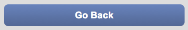
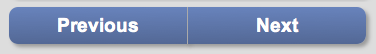
The .button entity can be employed by any module to create a stand-alone object that links elsewhere in the system. Often, this entity is used to provide a back button or directional navigation buttons (next and previous) for a specific page. It is not intended to be used inside of a content area element such as a .content-full or .menu-full, but instead it should be used as a direct child of the body tag. To create a button inside a content area element, please see the documentation page for content.
The #button-top entity can be employed by any module to create a stand-alone object that resides in the header and links elsewhere in the system. Often, this entity is used to provide a home button on a child page. It can be assigned to any <a> entity that will fit in a 16px by 85px space, as long as the <a> entity does not reside within a relatively positioned entity.
Example Code
Single Option Button
At the most basic level, a single option full width button can be created via <a.button>:
<a href="{LINK_URL}" class="button">{LINK_TEXT}</a>
Derived from this markup is <a.button.not-padded>, a variation where the button does not have padding on the edges of the browser nor rounded corners:
<a href="{LINK_URL}" class="button not-padded">{LINK_TEXT}</a>

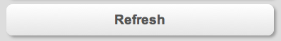
The framework also provides an alternate color scheme for buttons with <.light>:
<a href="{LINK_URL}" class="button light">{LINK_TEXT}</a>
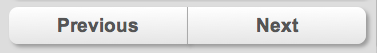
Two Option Button
The framework also provides the ability to create a two option button using a <div.button> entity:
<div class="button">
    <a href="{LINK_URL_1}">{LINK_TEXT_1}</a>
    <a href="{LINK_URL_2}">{LINK_TEXT_2}</a>
</div>
As with a single option button, the two option button also supports .not-padded:
<div class="button not-padded">
    <a href="{LINK_URL_1}">{LINK_TEXT_1}</a>
    <a href="{LINK_URL_2}">{LINK_TEXT_2}</a>
</div>
The <div.button> attribute also has support for a single button element:
<div class="button">
    <a href="{LINK_URL}">{LINK_TEXT}</a>
</div>
The above method is completely interchangeable with the <a.button> markup described in the single option section.
For two item buttons, the .light attribute is assigned at the <a> level, not the <div> level:
<div class="button">
    <a href="{LINK_URL_1}" class="light">{LINK_TEXT_1}</a>
    <a href="{LINK_URL_2}" class="light">{LINK_TEXT_2}</a>
</div>
The .light attribute may also be assigned to either option or both.
Top Button
Basic Use
At the most basic level, the <a#button-top> entity is defined as follows:
<a href="{LINK_URL}" id="button-top">{LINK_TEXT}</a>
Since the <a#button-top> entity leverages absolute positioning to position itself on the page, non-linear browsers (such as those found on T9 phones) will not be able to position the button correctly, and it will appear where ever you place the link in your markup. Use of the .not-basic class provides a mechanism for targeting only the non-linear browsers that support <a#button-top> positioning:
<a href="{LINK_URL}" id="button-top" class="not-basic">{LINK_TEXT}</a>
Recommended Use (Graceful Degradation)
The basic approach of <a#button-top.not-basic> works under most conditions, but for browsers that are not CSS compliant, graceful degradation is not possible. Furthermore, because basic browsers often need a home entity as well, the <a#button-top> entity is set up in such a way that it is fully compatible with <a.button> and its decorative styles.
<a href="{LINK_URL}" id="button-top" class="button">{LINK_TEXT}</a>
In this example the button will appear as a regular full width button on a linear browser, yet it will appear as a right-aligned button within the page <h1#header> entity on a non-linear browser.
Warnings
DOM Technical Warning for #button-top
The <a#button-top> entity leverages absolute positioning to place itself within the <h1#header> entity. As such, <a#button-top> cannot reside within a parent entity that is positioned relatively, but instead required either a statically (default behavior for an entity) or absolutely positioned set of parent entities. Further, <a#button-top> should not be employed on a page that does not include <h1#header>.
W3C Markup Note for <a.button>
It is recommended by the W3C XHTML standard that an inline element <a> is always enclosed by a block element such as <div>. However, this is not required in the case of <a.button-full>, as the <a> entity is itself defined as a block-level element, so all styling and positioning is set correctly without a parent element. Also, note that it is recommended that all framework modules validate with the HTML 5 doctype rather than an XHTML doctype.