Forms
Description
The form entity and its variations construct a distinct form area for a set of label and input elements that spans the full width of a page.
Intent
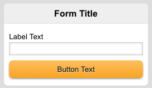
This entity can be employed by any module to create a form. Most commonly, it will contain a h1 header and sets of label and input pairs. This is an example of a simple form.
<form>
    <h1>Form Title</h1>
    <label>
        <span>Label Text</span>
        <input type="text" name="text-input" />
    </label>
    <input class="primary" type="submit" value="Button Text"/>
</form>
Setup
Use the JavaScript handler to import formsPolyfills for browsers that support it.
<script src="//{MOBILE_DOMAIN}/assets/js.php?full_libs=formsPolyfills" type="text/javascript">
Text Input
Your typical text input will have the following code.
<label>
    <span>Label Text</span>
    <input type="text" name="text-input" />
</label>
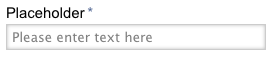
You can specify placeholder text by using placeholder="Enter text here".
<input type="text" name="text-input" placeholder="Please enter text here" />
You may use input types from HTML5 such as color, search, number, range, tel, url, email and date. The input shall be rendered appropriately by supported browsers.
Form elements
The following sections describes how to implement various form elements in MWF.
Textarea Input
<label>
    <span>Label Text</span>
    <textarea name="textarea-input"></textarea>
</label>
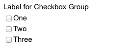
Option Input
Check boxes can be used the following way.
<label>
    <span>Label Text</span>
    <div class="option">
        <label>
            <input type="checkbox" value="1" name="checkbox-input" />One
        </label>
        <label>
            <input type="checkbox" value="2" name="checkbox-input" />Two
        </label>
        <label>
            <input type="checkbox" value="3" name="checkbox-input" />Three
        </label>
    </div>
</label>
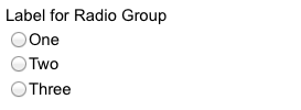
Radio buttons is used the same way.
<label>
    <span>Label Text</span>
    <div class="option">
        <label>
            <input type="radio" value="1" name="radio-input" />One
        </label>
        <label>
            <input type="radio" value="2" name="radio-input" />Two
        </label>
        <label>
            <input type="radio" value="3" name="radio-input" />Three
        </label>
    </div>
</label>
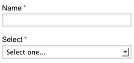
Select Input
<label>
    <span>Label Text</span>
    <select name="select-input">
        <option value="1">One</option>
        <option value="2">Two</option>
        <option value="3">Three</option>
    </select>
</label>
Required Input
Required input fields can use required="required" to provide extra visual cue and also client side validation if browser supports it.
<label>
    <span>Label Text</span>
    <input type="text" name="text-input" required="required" />
</label>
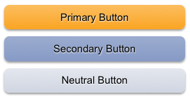
Form Button
MWF provides three types of form buttons: Primary Action, Secondary Action and Neutral.
<input class="primary" type="submit" value="Submit" />
<input class="secondary" type="submit" value="Submit" />
<input class="neutral" type="submit" value="Submit" />
<a class="primary button" href="#">Submit</a>
<a class="secondary button" href="#">Submit</a>
<a class="nutral button" href="#">Submit</a>
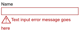
Invalid Input
Invalid input fields can be highlighted by adding invalid class. You can also supply messages to help user resolve the error.
<label>
    <span>Label Text</span>
    <input type="text" name="text-input" class="invalid" />
    <span class="invalid>Input error message here</span>
</label>